When beginning to formulate the ideas for this site, one of the key pieces for me was getting the logo and identity together. Like a lot of good artists and designers the worst client is oneself because we can never be satisfied. I had concepts and ideas, but fleshing them out to a point where I was pleased with the outcome was the most difficult part.
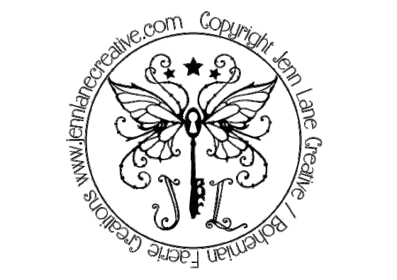
I wanted something that conveyed my style; clean but whimsical. Something that I could use as a watermark on images, would be recognizable as my own and resonated my personality. I wanted to incorporate imagery and concepts I love; wings, keys/keyholes, stars and flourishes without “gilding the lily” too much. I also love the round shape stamp/watermark that seems to be a trend these days.
I also have a fierce love of symmetry; balance is something i feel a tight connection to. If you look at a lot of Damask patterns you see that; elegant, balanced and whimsical. That is where I began drawing my inspiration.
I began the thought process by sketching out rough over all ideas as well as individual elements. I then picked out the ideas I wanted to use and scanned them all into Photoshop where I assembled the general image. Once I had it all lined up the way I wanted I took it into Illustrator and laid it down in vector format so it could be used in many different versions.  So that is how this logo came to be. It is flourished but simple enough to to be reduced without losing detail. The initials are balanced and designed to be a part of the logo or within the other identities. The Key is both its own key and lock; a concept I have always liked and really a paradox within itself. The teeth of the Key are the initials BF for “Bohemian Faerie”, the name I use on Etsy, as well as for my more whimsical endeavors. I want to be able to use the identities throughout the gamut of projects and ideas I use.
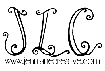
For my photography stamp/signature I wanted something that I could use as small as possible, not too detailed but was still using the theme of above. Using the complete watermark may take up too much space on a portrait, even if you use it as a transparency.  Using just the initials I had the ability to tuck the image in the corner of a portrait to present to clients but keep the URL present and large enough so that it is legible. It uses the hand designed lettering from the larger logo so it (along with the font choice) is recognizable as mine.


Yeay! Looks great!
Yeay! Looks fantastic Lady!
Loved seeing your design process! Graphic design always mystifies me. Thanks for the peek!
Great job! This looks very polished and definitely conveys our sense of style!